Monday, September 30, 2013

Kress & VanLeeuwen, "Reading Images"

I had trouble reading this article. It was a combination of the confusing page order, the references without pictures, and the industry terms that were difficult to understand in context. Nevertheless, I tried.

What a Great Coincidence!

Kress and VanLeeuwen discuss the placement of image in magazines, and their "reading path." This reminds me of reading magazines when I was younger (going back to GL, yes) and thinking it was such a grand coincidence that ads were so wonderfully placed. For example, if I was reading an article on how to get the perfect summer glow, on the adjacent page would be an ad for self-tanner. As an uninformed, unicorn-loving child I definitely thought this was pure chance, and certainly never consider that it was part of a great scheme developed in the marketing department of a huge company. Obviously, I have become more aware that pretty much everything orchestrated.

Kind of...

When Facebook first started directing ads at me, I still may have thought that it was a coincidence. Advertising Taylor Swift merchandise? How do they know?! Although I didn't understand at first, I realized they were tracking my activity and targeting me much quicker than when I was a GL-reading girl. Promise.

Let's Try!

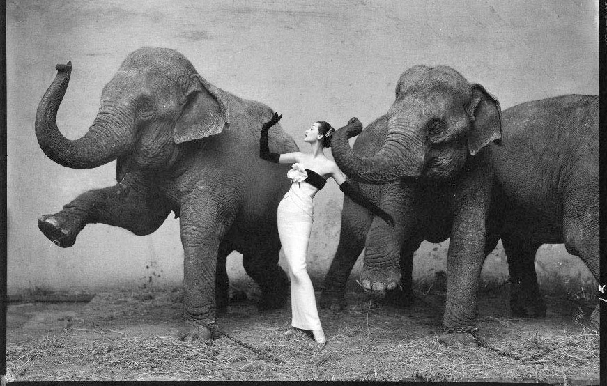
Since I have almost no idea what the article is talking about, I thought I'd try to analyze a picture based on what I did get from the article. Below is an interesting image I found online and an attempt at an analysis.

Disclaimer: This could be completely wrong.


Although I'm not sure of the information value of the image, I do know that the size and placement of the woman and elephants are salient. Additionally, the framing does not appear to separate the women from the animals; if anything they seem made to appear more similar than anything else. Do you believe that the image is made to represent the similarity between man and animal, or for another purpose?
In the center of the picture is obviously the woman, although she is clearly smaller than the two other objects (the elephants). The elephants are aligned left and right.
Something that we should also consider, but may not have the answer to, is the purpose of this image. It seems to be purely for artistic purposes, and I find it pretty intriguing. Not only is the model posed, but so are the elephants, which is pretty unusual (and pretty difficult I can imagine). The stark contrast between the woman's white gown and the elephant's dark skin helps for her to be the focus of the image. However, her lines mimic those of the elephants, as does her pose. To me, this makes the image more interesting--the similarity occurring simultaneously with the contrast.

Wednesday, September 25, 2013

Sturken & Cartwright: Viewers Make Meaning

The Eye of the Beholder

Have you ever looked at a picture and absolutely loved it, but never seem to get the same reaction from others? Obviously, tastes differ and people may like mountain views more than ocean views, but to me, at the core of everything is the connection a viewer makes; a connection to a past experience, a memory, a person, place that they want to be. This is what makes certain photographs so special to each viewer.

For example, this picture of the sun reflecting on the ocean is perhaps overly simple, but means the world to me. I took the picture on my Blackberry two summers ago, so it clearly is not the best quality nor overly interesting. I was on the ferry on a sunny day, headed to my favorite place in the world (Block Island), about to see some of my closest friends that I hadn't seen in several months when I took the picture. Now, whenever I look at this picture, I get a nostalgic feeling and instantly feel happy, even without a context. 

Being from the Ocean State, I also feel a sense of home when I see the ocean. However, as Sturken and Cartwright were discussing, I am part a group of viewers, and in order to fully understand the image I must understand my lack of individuality. When someone from a land-locked state sees an image containing the ocean do they think of vacation since the sea is less prevalent in their home?


Do Producers exist?

Barthes discusses how there is really no author of producer, but rather that texts are produced by the act of viewing them. If there is a website that exists to explain how the galaxy works, for example, can you really say that it is produced if it is never seen? It is there physically, but never being viewed negates the legitimacy of it. This is an interesting concept that could be taken too far philosophically, although it fits for the purpose of the article. 

Monday, September 23, 2013

Rowe: Framed and Mounted

There are athletes and then there are female athletes...

Why is the differentiation needed? In everyday life, it's not. However, in the media female athletes are severely underrepresented and misrepresented, and thus require a separate title than their "superiors." Not only are male athletes pictured and revered considerably more than female athletes, but the way in which they are presented is also skewed. The magazine covers for men and women's fitness magazines differ greatly; men are presented as strong and healthy, while the women's images are sexualized and offer secrets for staying skinny. Let's look at some images to better compare the two.


 To the left, the "fit" female is wearing a bikini that is fairly revealing, and certainly not something she would ever workout in. She is flirty-laughing and positioned in a way the is similar to soft-core pornography, as Rowe claims. Meanwhile, the man is completely clothed and positioned in a power stance that shows off his toned biceps. These two images depict a very different version of "fitness."


"Ladies" Sports

I remember reading an article in Girl's Life magazine (GL, embarrassing, I know) when I was about 11 years old about how what makeup stays on through sweat, and how to wear my hair in a sporty-cute way. At the time, I played soccer and basketball and could care less about how I looked while doing it. To me, sports were messy and sweaty and I had no problem with that; I remember being confused as to why people would put so much effort into their appearance when the emphasis was (or should have been) on how well they played. At the time I was amused and confused, and certainly didn't read into it until I read the article. However, now it makes perfect (but sad) sense. 

Although men are sometimes sexualized in fitness magazines, why do you think it is more common for women to be provocatively posed? Especially since it is generally women who read fitness magazines for females?

Wednesday, September 18, 2013

Sturken and Cartwright, "Images, Power, and Politics"

Mis-Representation

Sturken and Cartwright discuss how words and images "create meaning about the world around us;" that what they show is a representation of something else. However, there are also many instances where a picture can misrepresent something, or been seen in a different way. This can often be detrimental to the project, but sometimes it simply offers a new way to see the world.

Representations can also refer to a more philosophical viewpoint. For example, there is an image of a pipe, with "This is not a pipe" written in French below it.

While there are many ways to view this image, one could argue that the caption is true because it is not an actual pipe, but rather a representation of one. This reminds me of Plato's Allegory of the Cave and his Theory of Forms, both of which comment on the fact that there is one true object (like a pipe), and all the others are simply recreations. Plato's image of the cave shows that the prisoners (whom he infers are representative for people in society) are only seeing reflections of reality, through the shadows on the wall. It is only the enlightened man, whom walks towards the source of light to discover the sun and ascend to the world of forms, which is true reality.

This is related to the pipe image in that picture that we see represents the real thing, but the image itself is not a pipe. While this is the more philosophical way to view this image, do you believe (like many) that it was made on a more basic level, simply to be a joke?

Also, people often believe that pictures are direct representations of reality, in that an image of a woman crying is depicting sadness, when in reality they could be tears of joy, or something void of emotion that has been completely staged.

Recently, a video of a girl twerking and catching on fire went viral, and people went crazy. Some thought it was hilarious, some thought she deserved it for performing such a scandalous dance, and some felt pity for her, but regardless of how people felt, they shared it and accepted it as reality. It wasn't until Jimmy Kimmel revealed that it was all a hoax, crafted by his team and performed by a stuntwoman, that it became obvious how easily fooled the Internet community is. Images are everywhere online, and since they are seemingly a direct depiction of an event, people don't question them. However, it is what you don't see and what happens behind the scenes that matters the most. Why do you think people are so easily swayed by an image, despite there being so ways that images can easily be distorted?


Monday, September 16, 2013

Rettberg, Chapter 6


This chapter is called “Blogging Brands,” and discusses the business of blogging. I’ve always been interested in the business side of things, particularly of media, so I found this chapter particularly intriguing. Below are some of my thoughts and questions about the pieces that stood out the most to me.


“In just a few more years, the current homogenized “voice” of business-the sound of mission statements and brochures-will seem as contrived and artificial as the language of the 18th century French court.” 

This comes from a book published in 1999, and as we draw closer to 2014, it couldn't ring more true. Today's businesses need to be more human, start a relationship with customers, and continue to build trust; people don't want to feel like they are just a number or just a sale, they need to feel special. Creating a human relationship as a business is the way to do that. I'm not sure whether it is due to society or to the accessibility of technology that has made people think they are special and deserved to be treated so, but either way, it is something that businesses need to be aware of. Even the advertisements of companies have become more human focused. In a Google search of ads in the 1980s (top), you can see mostly products being pictured, with big tag lines. However, in the image of the 2013 ads, there are mostly human faces with little else besides the brand name. Human voice of business indeed.


"Manolo the Shoeblogger? Sorry, not me. But it's very funny, isn't it? Hilarious!"

This is a quote from famed shoe designer Manolo Blahnik, displayed prominently on a blog that supposedly records his thoughts and quips. "Manolo the Shoeblogger" is clearly not trying to deceive people into thinking he is the real Monolo, and adding the quote adds credibility. When I read this in the chapter, my initial reaction was disgust and frustration that someone was pretending to be someone else, until I saw the quote and understood the satire. The fact that the real Monolo likes the blog made ME like it more.


"But, it turns out, my blog is really personal, I take it personally, and I need it to be that way."

This is what one blogger said after she ended her contract that paid her to blog and link to a certain site. Another added that even though it wasn't a diary-stlye blog, it was still "really personal." I can completely relate to this, especially since I made this blog for class and only post about things related to digital communications. However, it is still my reflections and therefore still personal, but mostly, writing is a form of communication that is unlike any other because you can rethink and edit what you've said, but the inflections can't be shown and you can rarely see the readers reaction. It is almost an extension of your person that you put into the world to be criticized. Long story short, blogging is a very personal form of communication.


"Blogs are a way for corporations to try to create a 'human voice,' as the authors of The Cluetrain Manifesto would have said."

These corporation blogs set out to establish credibility and show expertise in the field, but also to create relationships with consumers. While I think this is a great idea for businesses, I often wonder how often they cross the line, particularly on social media. For example, when laptop maker ASUS tweeted this and received a lot of backlash.

With so many ways to be politically incorrect, are corporate bloggers more of a hassle for public relations? Especially since Rettberg talked about how bigger companies encourage their employees to blog about their professional experience. This is a BIG door to open, that has the potential to end very poorly. Why do bigger companies (who presumably have more to lose) relinquish so much control of much of the content that has their name on it? Rettberg discusses this somewhat when he talks about the need for transparency in corporate blogs, but I could also see other things going awry. An angry employee or a hacked account could be detrimental to the company's image.

Wednesday, September 11, 2013

Rettberg Chapter 4, "Journalism of Verification"

Chapter 4

To me, the idea of blogging is similar to that of keeping a journal; although many blogs are formal and educational, many of them simply share thoughts and opinions. This blog, for example, highlights the main points of our readings, but also explains some of my opinions. Often I feel like I’m babbling on about my life and experiences, which is the point I suppose, but also seems like it would be rather pointless to everyone else. Thus, it is hard for me to think about blogging as a form of credible journalism, even though I do sometimes read blogs for current events. 
Also, first hand accounts, like that from the Virginia Tech shooting, offer a new insight that is particularly intriguing and helpful to gaining a full perspective. Although it was a deeply personal account, I would still call it mostly credible and definitely important.
Is there a way to separate personal or uninformed bloggers from those that act as journalists?

"Journalism of Verification"


“The essence of journalism is a discipline of verification.”
I discussed this somewhat earlier, when I questioned the validity of bloggers because anyone can be one. Journalists are fighting a constant battle to legitimize themselves and their work, often doing so by fact verification.
However, journalistic bloggers have a harder time doing so since they rarely have editors and are published on a notably unreliable source, the Internet. It is extremely difficult for a blogger to verify their stories and opinions, although sometimes they try. Since journalists and bloggers both seek verification, which is the essence of journalism, by default can they both considered journalists without question?
I don’t know the answer to this question, but I sometimes wonder about its importance. As new mediums emerge and technology continually changes, should we work so hard to define something that may not even need definition in a few years? Or that doesn’t seem all that important to define now?

Rettberg, Chapters 2 & 3

Chapter 2


Overall, I found this chapter to be very interesting, especially the ideas about technological determinism and the modern public sphere. In this post, I’d like to elaborate on the idea of the public sphere.
In seventeenth and eighteenth century Britain there were coffeehouses where people would meet and were allowed the chance to discuss politics and other topics of the elite in a public, but safe atmosphere. Prior to coffeehouses, there were parlors where society’s elite and educated were invited to discuss similar topics. The idea that these group discussions were exclusive for a while before coffeehouses were invented is similar to how digital news sources were before the open forums began.


On television and the radio, only those who were invited to speak, due to either money, education, or experience, had the opportunity to share their thoughts. Now, with online forums and viewers texting or calling in, everyone has the opportunity to speak. While most are strong proponents for more conversation, some are against giving everyone equal ground, because not everyone is an expert on everything. However, this begs some questions: doesn’t more participation make a better democracy? Is it more beneficial to have only the educated speak, or for everyone to have a say? Quality over quantity?


Chapter 3


“What a small world!” This is something that I say often, although not surprisingly since I’m from the smallest state and I go to a small school. However, it appears that the world is shrinking smaller with the Internet, especially with blogs. The blogs I read daily are for entertainment or inspiration and they often link to other blogs, which leads me down a whole new trail of entertainment, and of course procrastination. I doubt that the bloggers personally know the authors of the other blogs, nor are they close via geographic location, and yet they are creating these ‘weak ties.’ The internet creates and foster thousands, if not millions of weak ties everyday. The way that I most often interact with people not inside my immediate circle of friends is mostly through Facebook. Sharing an article, liking a picture, or posting on someone’s wall is an easy way to initiate contact but doesn’t require much effort. Globalization through the Internet has certainly shrunk the world, but does it also foster more empty relationships? Are these relationships the same as weak ties, and thus beneficial or detrimental?


Wednesday, September 4, 2013

Chapters 4 & 7


Chapter 4

This chapter, “Headlines and Hypertext,” focuses on how to properly format a website so that viewers have an easier time navigating. One example that the book found helpful was the University of North Carolina website. Since Furman has recently revamped their own webpage, I thought it would be a good idea to evaluate Furman’s page based on Carroll’s points. How does Furman’s website, used to attract new students and utilized by current ones, rank according to Carroll?


Hypertext

Furman does a good job of including important hyperlinks on the homepage, but in the actual articles themselves the site is lacking. In the interest articles listed on the site (about freshmen move-in, for example) have few, if any hyperlinks, which decreases its overall value. The informational tools and sites do have many hyperlinks, helping students find more detailed information.


Headlines and Subheads

There are many headings, which is a little overwhelming  but there are plenty of subheads and headlines to help organize the site. It is fairly easy to navigate through and get the main ideas solely from scanning. 


Type

The font on Furman's homepage is excellent. Clear, concise, and still interesting enough without confusing the viewer more than necessary. 


Overall

Overall, I think that the Furman site is a little overwhelming. There is a lot happening on the homepage and while it maintains interest, it may be a little difficult to navigate sometimes. I do like the slideshow on top and the menu of the main categories that scrolls along with the page. These keep the site interesting and more manageable. Also, the search bar location is great--right on the top of the page! Putting the search bar in a poor location is one of my pet peeves.


Chapter 7


I had never really thought of how blogging came to be, or how it has transformed into a  form of journalism. It’s interesting to me because I believe that most of what I read on the internet is a form of blogging, even if I don’t realize it. Blogs are an excellent chance for people to share their thoughts and opinions, discuss current events, relay information, or simply entertain. 
Blogging as form of journalism is also an intriguing topic, as the book discusses the debate over bloggers are journalists. Carroll asks if all bloggers are considered journalists, but I wonder more about journalists as bloggers. Since blogs have become more popular, should all news sources have a blog(s)? These would allow opinion pieces from the journalists, but also give a platform for readers to respond. Most websites already cater to this by allowing comments on the stories, but I find that blog posts (if done properly) can be more informational and more interesting than a singular comment.

Huffington Post Evaluation


What is your first impression of the site? Think of the “3 second rule.” 
Our first impression of The Huffington Post website is that it is very overwhelming.  Even the tabs at the top are over stimulating, and there are too many pictures.

How does this site establish credibility? How does it establish trust? Or does it?  Authentic voice?  Genuine?  Transparency?
By looking at the website, it doesn’t immediately establish credibility because the more serious stories are mixed in with completely irrelevant “fluff”.  However, the articles themselves are generally credible, with appropriate quotes, interviews, and links to other articles.  There is a mix of unbiased, transparent articles as well as editorials and blog posts.
What is the general writing style? Biased?  Objective?
Generally the articles are written from an objective point of view; the blog posts and editorials are understandably biased.

Does the writer IDENTIFY with his or her readers, or not? How (or why not)?
The actual articles are more information based and focused on telling the facts, so these authors do not really identify with their readers within the article.  However, beneath some articles are picture slideshows with very persuasive and powerful images that do sway the readers.  The editorials and blog post authors do identify with their readers, because their writing is more passionate and opinionated, and seeks to persuade readers to their points of view.

Does the writing style get to the point?
The writing is very clear and concise, giving information but not unnecessary details, so it gets to the point very quickly. 

How is it arranged? Is it arranged in reverse pyramid style?
Yes, the articles are arranged in reverse pyramid style, with the most important facts and information at the beginning of the article.

Is content shaped for scanning? How is the content layered? 
Yes.  The content is layered with large images and smaller sections of text, so it is easy to scan.


Is the tone or rhythm of the site consistent throughout?
On the home page, the tone is not consistent because there are heavier articles placed below or right next to “fluff” articles.  However, within the articles themselves, the tone remains consistent.

How does the site use headlines? 
The main article that the site is trying to promote has a massive headline.  Other articles with pictures have smaller headlines.  The wording of the headlines draws readers in.

How does it use links? Effectively or not?
The Huffington Post uses links extremely effectively.  Every article (except the “Most Popular” articles) offers the option to select “quick read” with a one or two sentence abstract that gives the general information relayed in the story.  

How is multimedia used? Is it distracting? How is it displayed on the site? Does the multimedia tell the same story as the text, or a different side of the story?
Some multimedia, like the pictures used on the homepage, are overwhelming and distracting.  The pictures are displayed too often and too heavily.  However, the slideshows at the end of some articles and the videos used are very effective, and often tell a different story than the articles,  in the sense of offering more persuasive perspectives.  For example, an unbiased article about war had a slideshow at the conclusion with extremely powerful images that relayed information more intensely and persuasively than the text.

How does the site “package” stories?
In terms of the tabs at the top of the Web page, the site attempts to package stories based on their topics.  However, on the home page, major and minor stories are placed next to each other.  In some cases, “fluff” is placed above major stories.  This is not an effective way to package stories.  Additionally, each paragraph is relatively short.  The photos are clear and show almost solely human faces.  The font used is also Georgia, which is very readable.

How are graphics used? Too cluttered?  Are the graphics consistent through out the site, and consistent to the brand? Do they encourage or discourage use, and how?
The graphics are too cluttered on the home page.  However, in the articles themselves, the graphics contribute to the article.

Can each page stand on its own? 
Yes, each page and each article can definitely stand on its own.

How is the navigation? Do you get lost? Do you always know where you are? How (or why not)?
The site is fairly easy to navigate.  There is a prominently displayed search bar and tabs at the top of the page that separate stories into topics.  There is also a scrolling ticker at the top below the tabs that displays breaking news headlines.

How does the site incorporate/interact with its audience? How does it embody the social aspect of the internet (or does it)? 
The site effectively interacts with its audience by allowing them the opportunity to respond to articles by using a comment section.  The site also allows the audience the share articles on social media, and lists articles according to popularity.

Monday, September 2, 2013

Chapters 1-3


Chapter 1

Bhabha’s sentence is convoluted and complex, something that I sometimes mistake for “good” writing because it seems more educated. In other words, I (and presumably others) automatically consider more complex writing to be more intelligent, without any background knowledge. Obviously, this isn’t true, but rather something that I’ve just come to assume as I read more and more complex articles in my higher level classes. Also, who knew that there was an annual “Bad Writing Contest”?


Being extremely sarcastic, I completely agree with Plato in that the written word can sometimes be misunderstood, especially with one of today’s most common form of communication: texting. I am constantly having to explain what I mean or backtracking to explain a joke via text when I could’ve called the person and explained what I meant in half the time. Is texting more convenient? Sometimes, yes, but I think most of the time it would be easier and more efficient to call the person. Yet, I hardly ever do. Why are people more attracted to communicating through the written word than calling? Especially now, when so many people complain about how much they hate writing?


“Email, texting, social networking, IM, and chat arguably are having a corrosive effect on writing.” In my internship this summer, I had to read through about 100 of the applications from the incoming freshmen class. While many of them had high GPAs, impressive extracurriculars, and a bevy of academic awards, the majority of their essays were pretty terrible. Some were due to unmoving topics, but many of them were simply poorly written. Unfortunately, I don’t remember what my college essay was about, and I doubt it was particularly riveting, but I know that my writing was coherent and free of grammatical errors. Of course it’s only been two years since I was in their shoes, and I doubt that society has crumbled that much in such a short amount of time, but I believe that even in my year, student’s writing has been negatively effected by the new forms of communication. While this is an obvious claim, I was still surprised by the number of poor essays when I read the applications. 

Chapter 2

In my previous Communications classes we studied and discussed the importance of credibility. In Public Speaking we focused specifically on how to establish credibility as a speaker, something that is generally hard to do, particularly as a student. However, it is increasingly more difficult to do so online. Students will often refer to a Wikipedia page for information, overlooking the fact that ANYONE with access to the Internet can edit a Wikipage. As more and more professors have banned the use of Wikipedia as a source for academic papers it’s potential for inaccuracies has become more obvious. However, there are still millions of websites that appear to be legitimate, but still may not be. Previously, I had only considered .gov or .org to be reliable, but fortunately, the book lists several ways of deciding an online source’s authority. Deciphering between credible and non-credible sources online can be difficult, but is crucial. Making a website is pretty easy, and although it is difficult for speakers to prove their own credibility, it is arguably more so for online communicators. Also, an online source (or person) may be subtly advocating for something and determining their bias is important in both arenas. 
Only number 19? Really?
“Using Lists” - Lists tend to be the most popular form of communicating online. When I first heard this, I thought it was completely fabricated and could not imagine myself trying to read a list, unless I was checking Furman’s ranking. 

However, I quickly realized that most of the articles I read when procrastinating on Buzzfeed are lists; usually paired with humorous GIFs, and often ones that have nothing to do with me. The other day I read “15 Signs You Were an RA,” purely out of boredom, since I’ve never even been (or wanted to be) on hall staff. It probably has something to do with our shortening attention spans (thanks Google).